When to Use UPPERCASE in Writing (Hint: Rarely)
Use uppercase for acronyms and initialisms, for very short labels where your design calls for it, for legal text that has to be conspicuous, and for constants and placeholders in code. Almost everywhere else (paragraphs, long headlines, emphasis inside a sentence) mixed case does the job better. All caps is slower to read in bulk, and it has read as shouting since at least the mid-1990s.
What reading research says about all caps
You'll often read that capitals are slower "because words lose their shape." The first half holds up; the explanation is shakier. Kevin Larson, a reading psychologist who worked on Microsoft's ClearType team, reviewed the evidence in The Science of Word Recognition. Research reported as far back as Woodworth's 1938 textbook, and later studies by Smith (1969) and Fisher (1975), found that people read lowercase passages reliably faster, by roughly 5 to 10 percent.
Larson's point is that the gap is a practice effect, not a shape effect. We read lowercase far more often, and readers who are made to read large amounts of uppercase speed up. The model most reading psychologists accept, he explains, is that we recognize words from their letters, not from the outline a word makes. So the practical lesson is narrower than the myth: a two-word label in capitals is no real burden, but a paragraph in capitals slows nearly everyone down, because almost nobody has had the practice.
Capitals read as shouting, and have for decades
RFC 1855, the "Netiquette Guidelines" published in October 1995, put it plainly: "Use mixed case. UPPER CASE LOOKS AS IF YOU'RE SHOUTING." Three decades later, that reading hasn't faded. The Microsoft Writing Style Guide is just as direct: don't use all uppercase for emphasis. A subject line in capitals, or one capitalized sentence in a support reply, can read as anger whatever you meant by it.
When uppercase is the right choice
Acronyms and initialisms
NASA, HTML, PDF, USB, FAQ. These are conventionally written in capitals, and lowercasing them looks like a typo. Style guides do differ at the edges. AP, for example, writes a company name in all caps only when its letters are pronounced individually, which gives you BMW but Ikea. If your writing is full of acronyms, check what your guide does with ones that are said as words.
Short labels in an interface
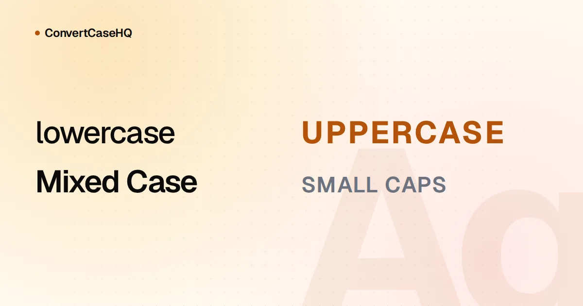
Eyebrow labels above headlines, table column headers and small badges ("NEW", "BETA") are where capitals earn their place: they give a few characters presence at a small size. Keep them to one to three words. Two typographic habits help. Add a little letter-spacing, since capitals at normal spacing look cramped. And when acronyms sit inside running text, consider small caps (CSS font-variant-caps: all-small-caps) so they don't shout over the surrounding words.
If the capitals are a design decision, make them in CSS rather than in the text. Write "New" and style it with text-transform: uppercase. The words stay in normal case underneath, so a future redesign is a one-line stylesheet change instead of a hunt through every string in the product. Our post on all caps and accessibility goes deeper on the accessibility side.
Legal text that must be "conspicuous"
Under the US Uniform Commercial Code, a written disclaimer of the implied warranty of merchantability must be "conspicuous" (§ 2-316), and the code's definition of conspicuous (§ 1-201(b)(10)) includes "a heading in capitals equal to or greater in size than the surrounding text." That's the usual explanation for the capitals in the warranty sections of software licenses. The MIT License, for one, ends with a paragraph that begins "THE SOFTWARE IS PROVIDED 'AS IS', WITHOUT WARRANTY OF ANY KIND."
The same definition also accepts larger type, or a contrasting type, font or color, so capitals are one way to make a term stand out, not the only way. If it's your contract, that's a question for your lawyer rather than your style guide.
Constants, environment variables and placeholders
In code, capitals usually mean "this value doesn't change." Python's PEP 8 says constants are "written in all capital letters with underscores separating words," with MAX_OVERFLOW and TOTAL as its examples. Environment variables follow the same habit (NODE_ENV, DATABASE_URL). Google's developer documentation style guide uses all capitals for placeholders, the parts of a command a reader replaces with their own value:
cp SOURCE_FILE DESTINATION_FOLDEROur cheat sheet of developer case styles covers CONSTANT_CASE and the rest of the family.
When to keep caps lock off
- Body text. Anything longer than a line or two. Readers slow down, and a block of capitals is hard to scan for the one sentence that matters.
- Long headlines. A six-word headline in capitals is a design statement. A fourteen-word one is a wall.
- Emphasis inside a sentence. Italics or bold do it without raising your voice. We compare the options in when to italicize, bold or capitalize for emphasis.
- Names that aren't acronyms. A company that sets its logo in capitals isn't necessarily asking you to write its name that way in a sentence. Check its own press materials, then your style guide.
Uppercase isn't always reversible
Changing case can lose information, especially outside English. German ß traditionally has no capital form in everyday use, so most software (JavaScript, and therefore our converter, included) turns "Straße" into "STRASSE." Lowercase that and you get "strasse," not the original word. A capital ẞ does exist in Unicode, but it isn't what the default mapping produces.
Turkish has dotted and dotless i as separate letters. The capital of "i" is "İ" and the lowercase of "I" is "ı," so a generic uppercase function writes "ISTANBUL" where a Turkish reader expects "İSTANBUL." ConvertCaseHQ applies the Turkish rules when you use the site in Turkish and the general Unicode mapping otherwise. If you're uppercasing names for a database or a printed badge, keep the original mixed-case version too; you can't always rebuild it.
Fixing text that arrived in capitals
Old database exports, forms filled in with caps lock on, a legacy system that only stored capitals: you don't have to retype any of it. Paste the text into our case converter and choose Sentence case. It lowercases everything and capitalizes the first letter of each sentence, so "WE USE NASA DATA. I THINK IT HELPS." becomes "We use nasa data. I think it helps." Then put back what the converter can't know about: names, acronyms, and the pronoun "I" when it falls mid-sentence.
A quick test before you reach for caps lock
- Is it an acronym, a code constant or a placeholder? Use capitals.
- Is it a label of three words or fewer, and are capitals a design rule you apply everywhere? Use capitals, set in CSS.
- Does a law or contract require it to stand out? Capitals are one option; ask whoever owns the legal text.
- Is it anything else? Use mixed case, and let your words do the emphasizing.