Accessibility and Case: Why ALL CAPS Hurts Readability
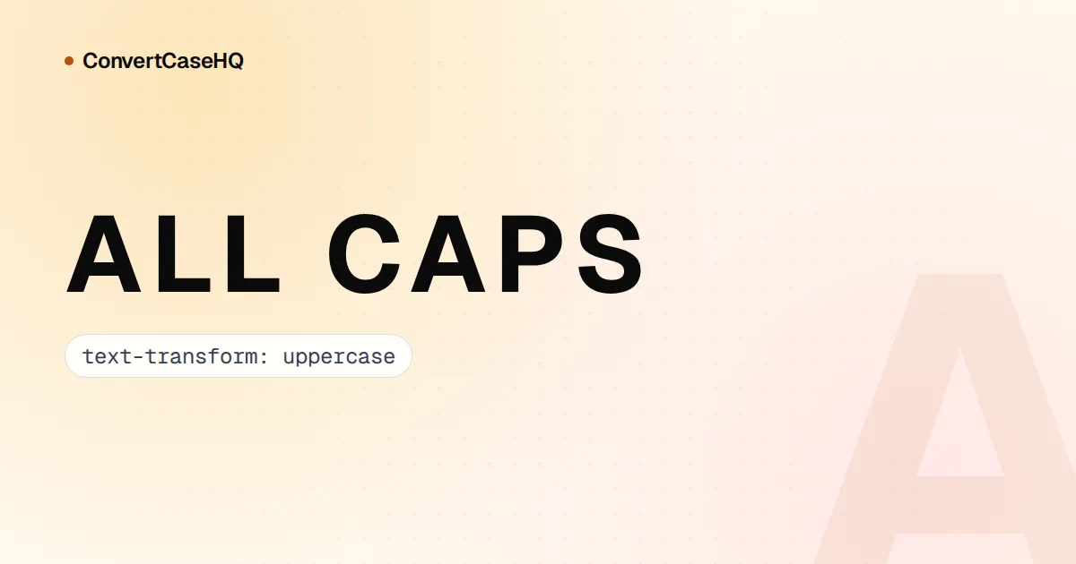
All caps is fine for a two-word label and a poor choice for anything longer. Long runs of capitals are slower to read, they throw away information that normal case carries (is "US" the country or "us"?), and screen readers mostly ignore capitalization, so the emphasis you meant disappears while the odd short word gets spelled out letter by letter. The accessible approach is to write text in normal case and, where a design really wants capitals, apply them with CSS, though even that isn't foolproof.
Why all caps is harder to read in long runs
Researchers have compared all-caps and lowercase reading for the best part of a century. Kevin Larson's article for Microsoft, "The Science of Word Recognition", summarizes studies going back to Woodworth in 1938: readers got through lowercase passages 5 to 10 percent faster than the same passages set in capitals.
The popular explanation is "word shape": lowercase words have distinctive outlines thanks to ascenders and descenders, while capitals turn every word into a rectangle. Larson argues the evidence doesn't back that up. We recognize words from their letters, and lowercase wins mainly because it's what we practise on. People made to read lots of uppercase get faster at it.
That's a useful correction, but it doesn't rescue the paragraph of capitals on your site. Your readers haven't had that practice, and the cost lands hardest on people who already find reading effortful. MDN's page on text-transform warns that large sections of uppercase text "may be difficult for people with cognitive concerns such as Dyslexia to read". The GOV.UK style guide makes the point by example: "DO NOT USE BLOCK CAPITALS FOR LARGE AMOUNTS OF TEXT AS IT'S QUITE HARD TO READ."
Capitals throw information away
Mixed case isn't decoration. A capital tells you a word is a name, an acronym or the start of a sentence. Read this and notice how much you have to guess:
PLEASE CONTACT US ABOUT POLISH ORDERS IN MARCH. NASA SAYS HI.The United States, or us? Customers in Poland, or furniture polish? The month, or a protest? Once text has been typed in caps, software can't recover the answer either. Run that line through the Sentence case option in our case converter and you get "Please contact us about polish orders in march. Nasa says hi." It lowercases everything and capitalizes the start of each sentence, which is all it can know. The names have to go back in by hand.
What screen readers do with all-caps text
Mostly, nothing. Screen readers speak the words and don't mention their case. In 2022 accessibility consultant Adrian Roselli tested all-caps legal text with JAWS, NVDA, Narrator, Orca, VoiceOver and TalkBack at default settings, and none of them told the listener the text was in capitals. Options like NVDA's pitch change or "say cap" are aimed at moving through text one character at a time, not at sentences read aloud.
That has two consequences:
- Caps used for meaning are lost. If capitals are how you say "this matters" (a warning, a contract clause, a shouted word), a listener hears ordinary text. Braille readers are the exception, because braille has a capital sign.
- Some short words get spelled out. Speech engines guess whether a run of capitals is an acronym. Roselli names "AM", "ADD" and "IT" as words screen readers often spell out in caps, and practitioners have reported "CONTACT US" coming out as "contact U.S."
Which words get spelled out depends on the screen reader, the voice, the user's settings and sometimes the browser, and it shifts between versions. You can't predict it reliably, which is the best argument for keeping important words out of capitals in the first place.
Never fake letter-spacing with spaces
Widely spaced capitals are a popular design touch, and typing them as S A L E is the worst way to get the look. Screen readers read each letter on its own, and WCAG lists "using white space characters to control spacing within a word" as a failure (technique F32). Use CSS letter-spacing, as in the example below.
Use CSS text-transform: uppercase instead of typing caps
If a button, tab or small heading needs to look like capitals, write it in normal case and let CSS change its appearance:
<button class="caps">Add to basket</button>

.caps {
  text-transform: uppercase;
  letter-spacing: 0.06em; /* capitals need a little extra room */
}
The text in your HTML stays "Add to basket", and that buys you a few things:
- Redesigns are cheap. Dropping the capitals later is one line of CSS, not a hunt through every label and translation file.
- The text travels well. Feeds, exports and anywhere else your stylesheet doesn't reach get properly cased words.
- Languages are handled for you. Browsers apply language rules from the
langattribute. The MDN reference for text-transform lists them: Greek vowels drop their accents in all caps, for example, and Turkish pairsiwithİ. With CSS the stored Greek keeps its accents; typed capitals would lose them for good.
Don't oversell it, though. Browsers can hand the transformed text to assistive technology. A WebKit bug filed in 2016, still open, describes VoiceOver reading an uppercase-styled "Add to Cart" button as "A D D to cart", and developers have reported the same with VoiceOver in Chrome. And CSS capitals are still capitals for sighted readers, so the cost of long runs doesn't change. Treat text-transform as the right way to apply caps to a few words, not as permission to set paragraphs in them.
When capitals are fine, and what to use instead
Capitals aren't banned. WCAG has no success criterion against them, and short runs cause little trouble. We'd keep them for:
- Real acronyms and initialisms, such as NASA, HTML and BBC.
- Short labels, tabs and the small "eyebrow" line above a heading. Our rule of thumb is three words or fewer, applied with CSS.
- A single badge word like "New", as long as nothing depends on hearing it as special.
For everything else, reach for something that survives being restyled or read aloud:
- Emphasis: use
<strong>and style it with weight or size. Most screen readers don't announce bold by default either, so put the important part in the words themselves: "You can't undo this" says more than any formatting. - Warnings: a short, plain heading ("Deleting your account removes all your files") does the job a block of capitals was trying to do, and it's spoken.
- Legal text: US contracts often set warranty disclaimers in capitals because the Uniform Commercial Code requires them to be "conspicuous". Its definition doesn't require capitals in the body of a document: larger type, contrasting type, font or colour, or marks that set the text apart also qualify. Check with whoever drafts your terms before changing them, but capitals aren't the only route.
Fancy Unicode "small caps" aren't caps at all
Our fancy text generator has a "small caps" style, and it's worth being honest about what it produces. Type "Sale on now" and you get "sᴀʟᴇ ᴏɴ ɴᴏᴡ". Those aren't letters drawn smaller; they're different characters, mostly borrowed from phonetic alphabets. Some letters have no small-capital version, which is why the "s" stays an ordinary lowercase s, and "q" comes out as "ǫ", an o with an ogonek.
To software, these are unrelated symbols, so spell-checkers tend to flag them and searches for the plain word can miss them. Screen readers handle look-alike characters very inconsistently; when similar "fake bold" letters were tested, some screen readers skipped the words completely. Our guide to writing for screen readers walks through that test. Use these styles for decoration next to plain text, never for words someone needs to hear.
A quick checklist for capitals
- Type text in normal case and apply capitals with
text-transform. - Keep caps to a few words. Never a paragraph.
- Add a little
letter-spacingto capitals, and never use spaces for it. - Put meaning into words, not into formatting.
- Listen to your key buttons and labels with VoiceOver and NVDA before launch.
- Keep Unicode look-alike letters out of anything that matters.
For the places capitals genuinely belong in writing, from acronyms to legal headings, see our guide on when to use uppercase.