The History of Letter Case: From Majuscule to Minuscule
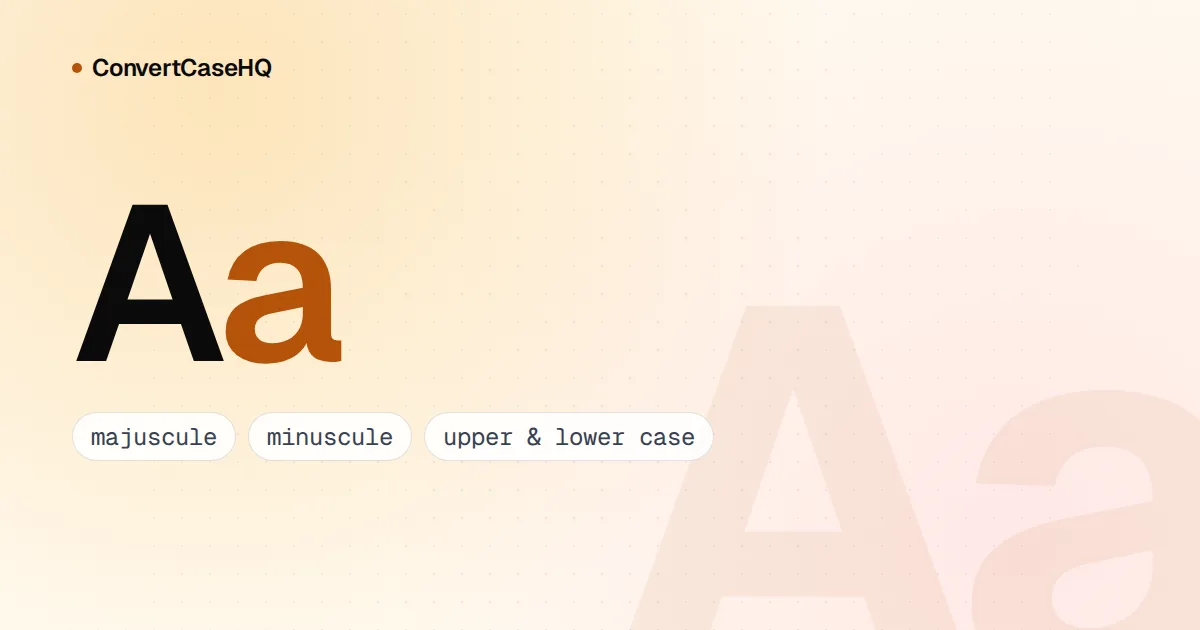
We have two sets of letters because two traditions merged. Capitals, or majuscules, descend from the formal letters of Roman inscriptions; lowercase letters, or minuscules, descend from the quicker, rounder book hands of medieval scribes, above all the Carolingian minuscule of the late 700s. Renaissance scholars paired the two, early printers turned the pairing into type, and compositors kept capitals in the upper of two type cases and small letters in the lower. That's where "uppercase" and "lowercase" come from.
Roman capitals: an alphabet with one case
Classical Latin had no lowercase. Its most formal letters, the square capitals, were used above all for inscriptions, and the lettering at the base of Trajan's Column in Rome, finished in 113 CE, is the best-known model. It still shapes type today: Adobe's Trajan, designed by Carol Twombly and released in 1989, is an all-capital font adapted directly from it.
Romans didn't write everything in carved-looking capitals, of course. Everyday writing used cursive scripts: old Roman cursive, common from the 1st century BCE to the 3rd century CE, and new Roman cursive from about the 3rd century to the 7th. Letters written fast with a pen grow rounder and simpler, and later Roman cursive became part of the basis for the book scripts that followed.
Uncial and half-uncial: rounder letters for parchment
From roughly the 4th to the 8th century, Latin and Greek scribes copied books in uncial, a broad, rounded script that suited a pen on parchment. Uncial was still a majuscule script: one set of letters of mostly even height. Its name is usually traced to a passing remark by St Jerome, and since the Latin uncialis could mean "inch-high", scholars still debate exactly what he had in mind.
Half-uncial, used from around the 3rd century to the end of the 8th, is where letters start to look familiar. Strokes reach above the line in b, d, h and l and below it in f, g, p and q. Those ascenders and descenders, which need four guide lines instead of two, are the defining feature of what we now call lowercase, and palaeographers place half-uncial between the majuscule and minuscule families.
Carolingian minuscule: the ancestor of lowercase
The decisive step came in the Frankish kingdom in the late 8th century. Carolingian minuscule was clear and compact, with well-formed separate letters and spaces between words. It spread with the educational reforms of Charlemagne, who brought the English scholar Alcuin of York to lead his palace school in 781. Alcuin later became abbot of St Martin's at Tours, and he's credited with promoting the script as the official court hand.
Charlemagne didn't invent it, though. Early examples come from the abbey of Corbie in northern France, and in 2013 Heidelberg University scholar Tino Licht reported a Corbie manuscript in the new script that, by his dating, came before Charlemagne's rule. The script there looks experimental; as he put it, "They were trying it out."
Carolingian books also used capitals for titles and lowercase for the body of the text, so a single page already combined big formal letters with small working ones. That's the seed of what we still do: capitals for beginnings and headings, minuscules for the reading.
From blackletter to the humanist revival
Over the following centuries, minuscule handwriting grew narrower and more angular, ending in the Gothic scripts we now call blackletter. When Johann Gutenberg printed his Bible in Mainz in 1454–55, his type imitated textura, the formal blackletter of German liturgical manuscripts, with close to 300 different characters including ligatures and abbreviations.
In Italy, scholars went the other way. In the first decade of the 15th century, Poggio Bracciolini developed a new humanist script, which the Florentine humanists Niccolò de' Niccoli and Coluccio Salutati embraced. Its model was the clear minuscule of 11th- and 12th-century manuscripts, which they took to be ancient Roman writing; in fact it was the Carolingian tradition. For capitals, they went back to the genuine Roman article, and scholars such as Felice Feliciano studied ancient inscriptions to recover the proportions of classical letters.
That combination, imperial Roman capitals beside a minuscule descended from Charlemagne's scribes, is the Latin alphabet as we know it. Venetian printers turned it into type. Nicolas Jenson's roman, first used in his 1470 edition of Eusebius, is often cited as the design that made the definitive break from blackletter, and in 1501 Aldus Manutius introduced an italic type modelled on chancery handwriting.
Upper case and lower case: the compositor's drawers
Once letters were pieces of metal, they needed somewhere to live. Hand compositors worked from a pair of shallow wooden cases, and Joseph Moxon's 1683 printing manual, Mechanick Exercises, describes them: "By the Case is meant, in Printers common diolect, a Pair of Cases, viz. the Upper and the Lower-Case."
The two cases were organized differently, and the difference tells you how each set of letters was used. Moxon's upper case had 98 boxes of equal size, with the capitals laid out alphabetically. The lower case had 56 boxes in four sizes and was "not devided according to an orderly succession of the Alphabet". Instead, the most-used letters sat in the biggest boxes near the middle, "That the Compositers hand may have the quicker access to them." Small letters did the daily work; capitals waited above. You can read the passage yourself in Moxon's Mechanick Exercises on Project Gutenberg.
Merriam-Webster dates the first known use of "lowercase" to that same year, 1683, and traces it to "the compositor's practice of keeping such types in the lower of a pair of type cases". The scholarly terms reached English a little later. "Minuscule" (first known use 1701) comes through French from Latin minusculus, "somewhat smaller", and "majuscule" (1722) from majusculus, "rather large". Palaeographers use them for handwritten scripts; "upper case" and "lower case" belong to print.
The drawers themselves eventually merged. In the 19th-century United States the California job case, a single drawer holding both capitals and small letters, became the most popular layout, but the old names stuck.
Why this history still matters for text today
Case isn't universal. Latin, Greek, Cyrillic and Armenian are "bicameral" scripts with two cases, while most of the world's writing systems, including Arabic, Hebrew, Devanagari and Chinese, have only one. And because the two sets of letters grew up separately, they don't always map neatly onto each other:
- German ß traditionally becomes SS in capitals. A capital ẞ was added to Unicode in version 5.1 (2008), and the Council for German Orthography accepted it as a variant in 2017.
- Turkish has a dotted and a dotless i, so its pairs are i/İ and ı/I. Uppercasing "istanbul" with English rules gives "ISTANBUL"; with Turkish rules it gives "İSTANBUL".
That's why case conversion has to know the language. Our case converter applies Turkish casing on the Turkish version of the site and standard Unicode rules elsewhere, which turn "Straße" into "STRASSE". What no converter can do is restore capitals that were never there: lowercase a paragraph, switch it back to Sentence case, and every name will need fixing by hand. Our guide to why proper nouns stay capitalized covers which ones to put back.
The history also explains the practical advice. Capitals were refined for inscriptions meant to be read at a distance and later used to mark beginnings; minuscules grew out of quick pen work and were refined for books. Use them the same way: lowercase for running text, capitals for starts, names and short display lines. Our posts on all caps and readability and choosing case for a brand pick up from there.